
Monochrome photography along my travels
It is no secret that monochrome photography was the first form of photography. Great classic artists mastered it over time. Black and white, or tones of one color work great with candid, photo-journalistic, street and some documentary photography, but not only. Take a look at some of Ansel Adams work for example.
I like colors myself, but in some cases I think that monochrome works better. It always depends on the feeling I want to give to a picture. In this photo for instance, I thought that black and white would be more powerful in showing the abuse of animals. – These monkeys were waiting to be transported over the border between Guatemala and Mexico:
The photo below is also from Guatemala. It shows a family in Santiago, Guatemala waiting for the bus. I thought that brown/sepia tones would convey a warmer feeling to it:
Sometimes I like the humorist aspect of scenes I see. In this case I chose again black and white for a more dramatic feeling. It shows the long waiting line for the flight to the Caribbean in January. – Ottawa airport 🙂
Monochromatic photography can create more artistic images
Here are some I like from Mexico:
Girl feeding pigeons on the Campeche, plaza:
Church Mesa in Campeche, Mexico:
Mayan boy in the Mexico countryside:
Monochromatic photography for historic images
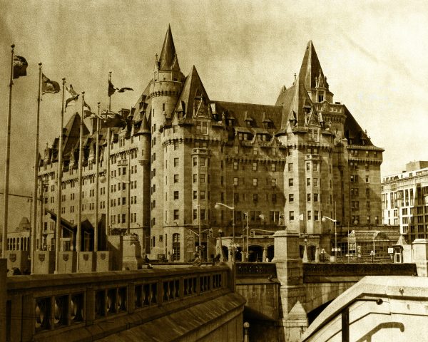
Nevertheless, the monochrome style, especially sepia, looks good in historic scenes, giving them the sense of old. In 2012 I participated in a contest dedicated to the 100 years celebration. I found two historic buildings in Ottawa, Canada built in 1912. One was the Chateau Laurier Hotel, the other the Central Train Station. I made them using sepia tones, and looking like old postcards. * I used my own crashed wrinkled sheets of paper as an overlay for both. Here they are:
Chateau Laurier – A Century Of Existence – 1st place winner ! (Prize: one year free subscription at SmugMug)
The Antique Central Train Station Building In Ottawa
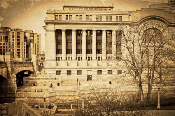 I uploaded them both to my FAA Black&White and Chromatic gallery and they are available as art prints for wall, home decor and accessories.
Well, as you can see in my FAA gallery, monochromatic photography can go well with many subjects like:
Landscapes:
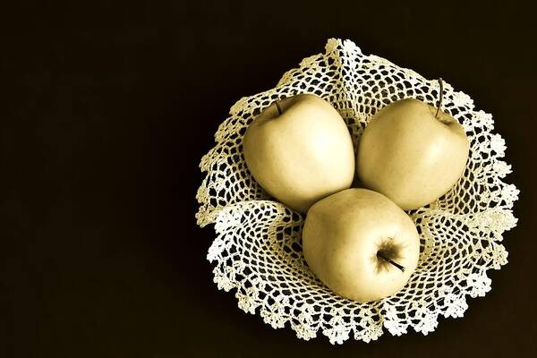
Still life:
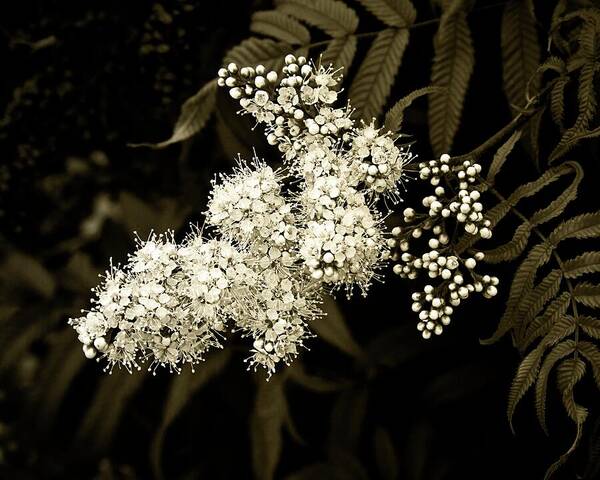
Even Floral subjects:
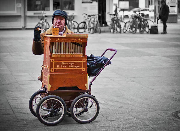
As a bonus, I have this Organ Grinder photo I took in Hamburg, using black and white and selective coloring:
I hope you enjoyed my Monochromatic photography. I have many more, but for some further posts 🙂
Lens-Artists Photo Challenge #70: Monochrome | Cee’s Fun Foto Challenge: Basically One Color or Hue |



lovely selection.
Thank you 🙂
Wonderful post. 😀
Thank you Cee Neuner!
The apples are epic!
Thank you Manja 🙂
These snaps are certainly amazing. Very nice captures 🙂
Thanks Hammad!
A fabulous collection, Tatiana. You really show the wide range of applications for monochrome. I especially love your winning shot of the hotel and the still life shot. Sepia works perfectly for those shots. The selective use of color in the organ grinder shot is great, too. Thanks so much for joining us and adding to our “conversation” about monochrome.
Thank you a lot Patti for your comments! I really liked your examples too 🙂
Wonderful!
Excellent selections. I can see you put some thought into them. Love the sepias. The hotel reminded me of The Balmoral in Edinburgh, which is similarly massive but doesn’t have the steeples like yours.
Thank you John! It is actually a Fairmont hotel.
Enjoyed very much of your monochrome travel photos,. They do create artistic image, beautiful!
Many thanks Amy for the nice comment! 🙂
A great gallery, Tatiana! Love especially the flower and Chateau Laurier.
Thank you very much Leya! 🙂
Well done, Tatiana! I love the historic feel of these photos. -Sharon
Thank you Sharon! Stay tuned – I will have a WP challenge with FB posting I think this week, on travel!. I hope you will participate 🙂